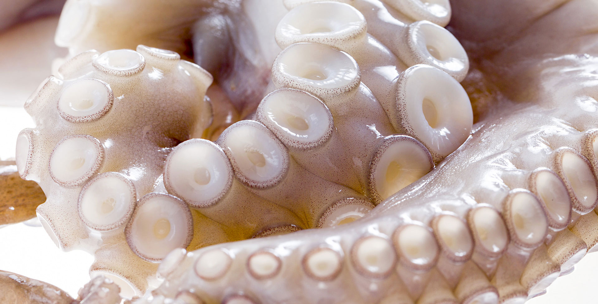
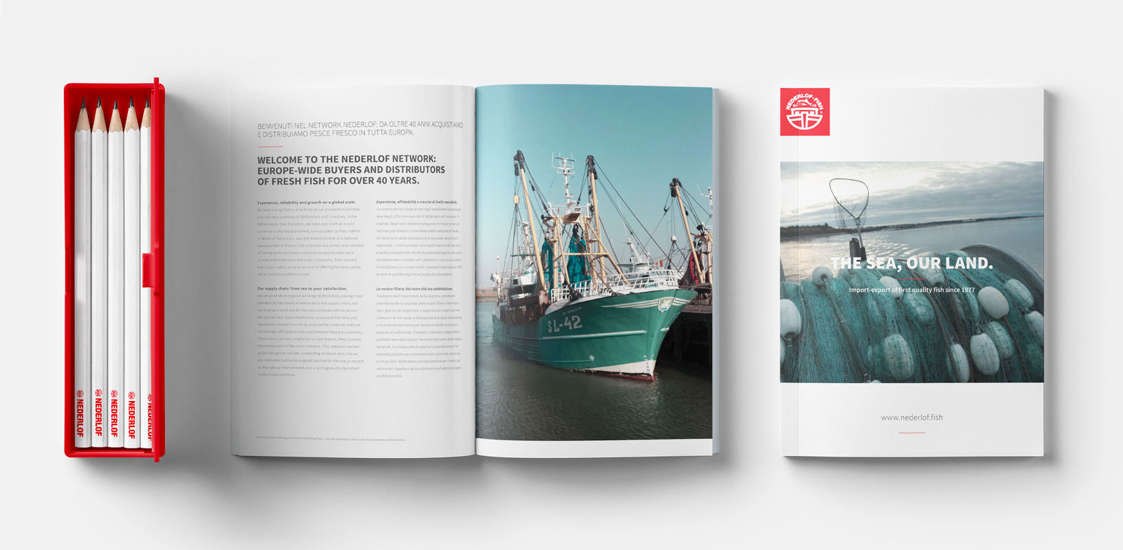
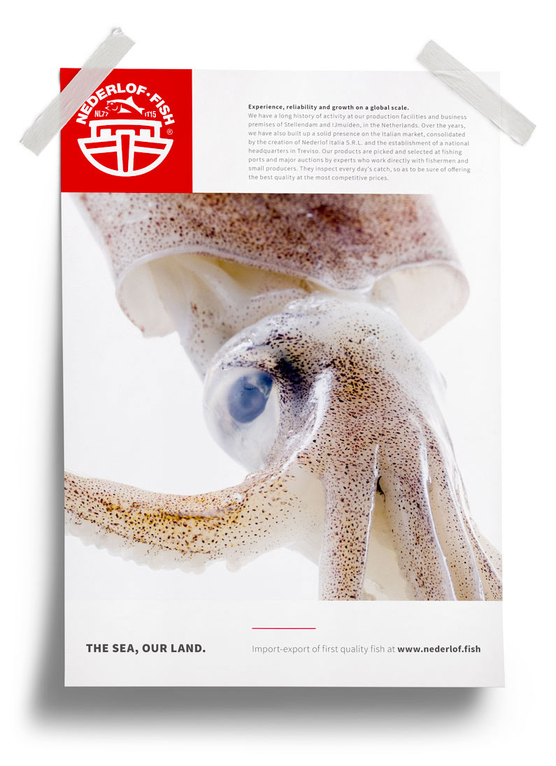
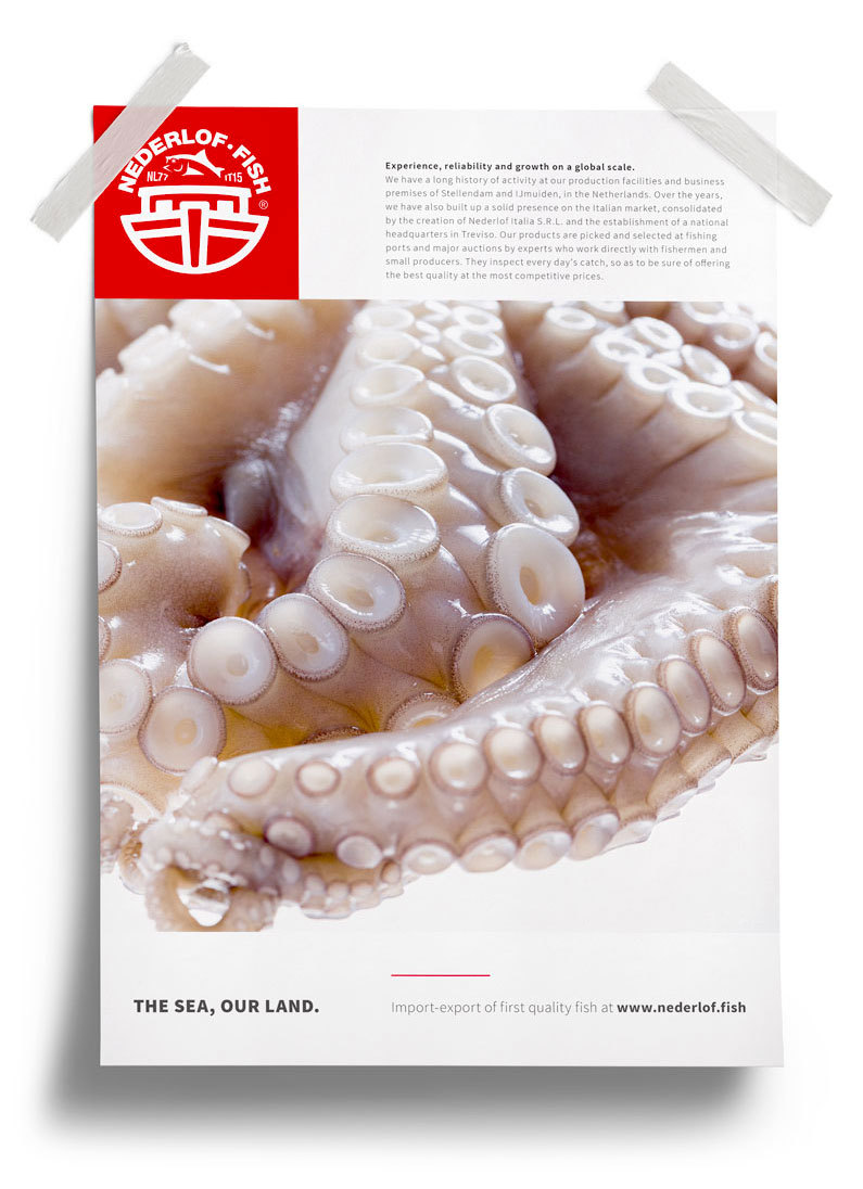
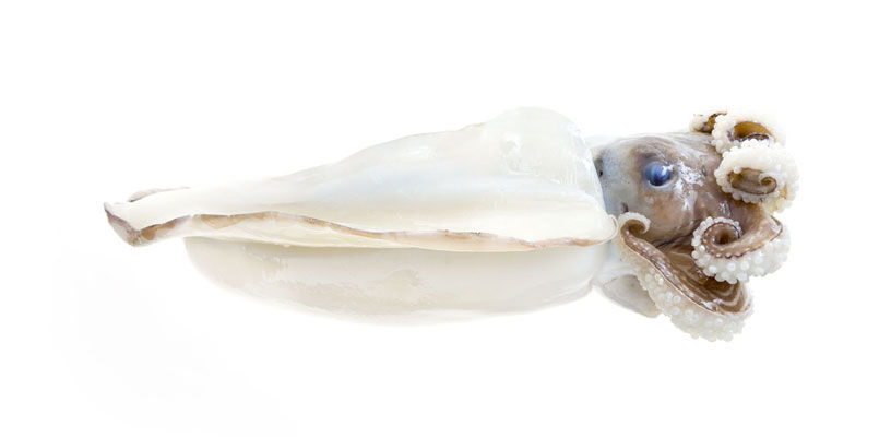
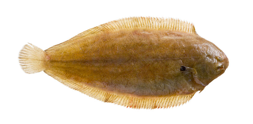
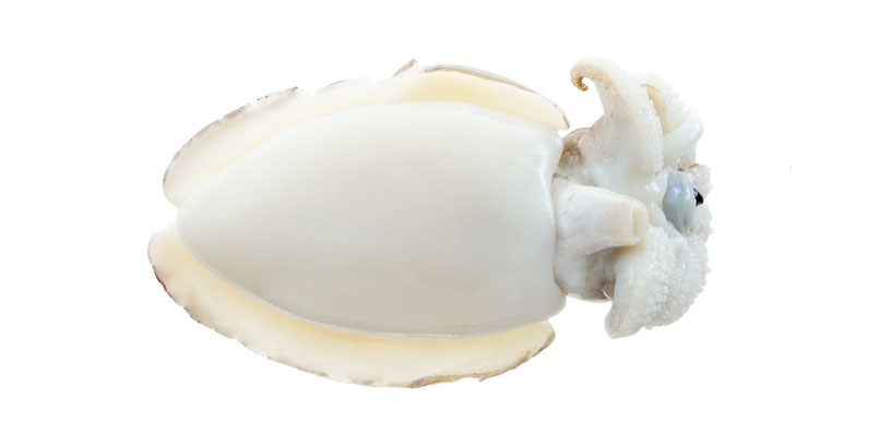
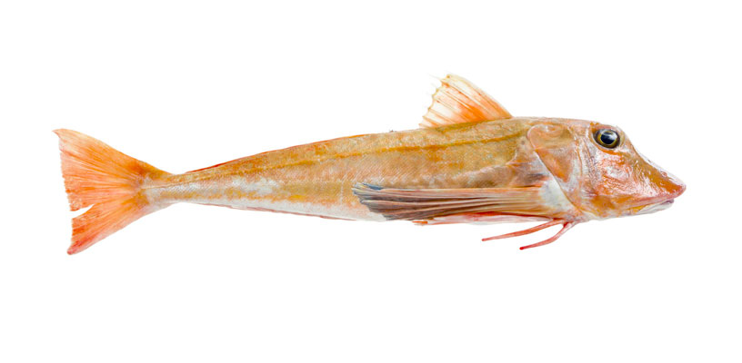
Lo shooting fotografico è sempre la soluzione migliore per creare un’immagine unica e distintiva. Anche per Nederlof abbiamo scelto questa strada, ottenendo degli scatti dove la materia prima viene esaltata in tutta la sua freschezza.
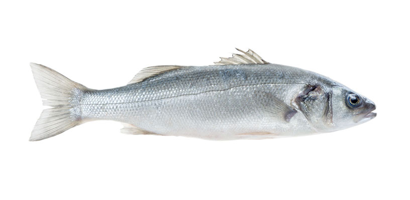
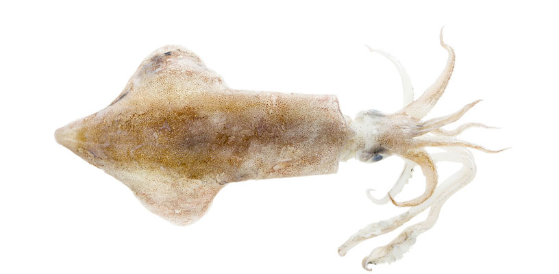
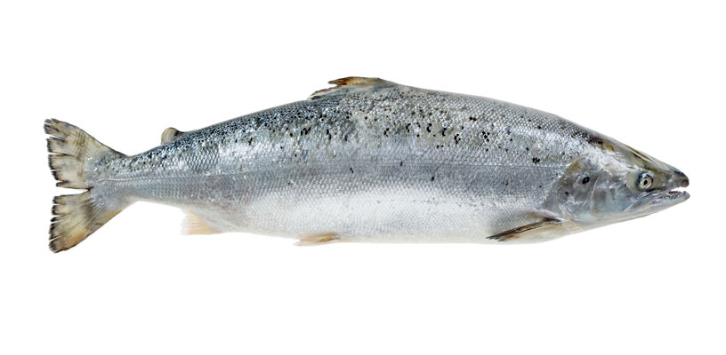
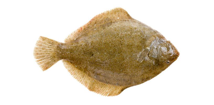
La forza delle immagini
Abbiamo utilizzato le immagini dello shooting come le fondamenta creative su cui costruire i materiali di comunicazione successivi. Company profile, schede prodotto e sito web, in tutti questi progetti ci siamo concentrati sulla creazione di un contesto essenziale in cui la qualità del prodotto potesse emergere, distinguendo il brand in un mercato caratterizzato da un’immagine tradizionale ormai datata.